Korn Ferry
Global leader in synchronizing strategy and talent and is one of the most dynamic players in its sector. Established in 50 countries and on 6 continents, Korn Ferry distinguishes itself by helping organizations hire the right people. The new website needed to reward, develop, and motivate its users and empower their clients.
Challenge
The biggest requirement for the website redesign was adhering to a wireframe created by an external company with Korn Ferry stakeholders. More importantly, the new experience had to be compatible with thousands of existing content pages. A heuristic evaluation helped uncover that the number of user journeys from one place to the other was limited due to an overwhelming navigational hierarchy over three levels deep and nestled within a hamburger menu.
Insight
The brand was very active in social media and sharing content about their services and market trends, but accessing the thousands of content pages throughout the site was almost impossible. Fixing UX accessibility issues and creating a clean aesthetic to maximize content consumption would define the success of the project.
Approach
Taking into account the relationship between the existing code and the implementation of the new design, we worked to develop a user interface that could be progressively enhanced. A grid based modular system was created taking into account hundreds of elements and modules featured in the low-fi wireframes.
The confusing navigation was discarded for a more accessible top menu featuring a secondary pop-up menu. This enabled users to navigate the pages with ease while gaining access to microsites featuring additional levels of navigation and filters.
Content Is King
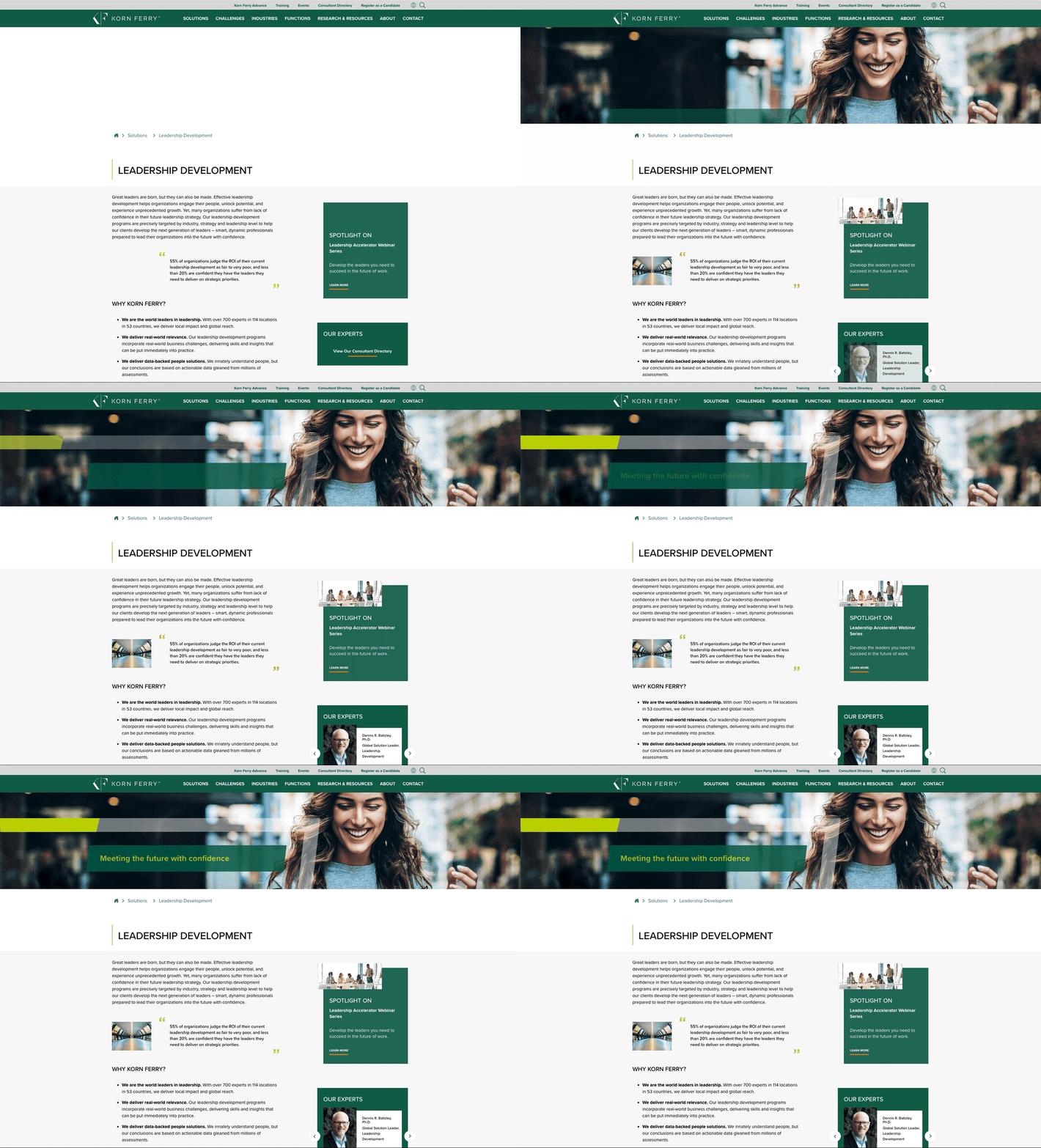
To ensure the content was consumed, careful attention was paid to image selection and typography. The Proxima Nova typeface was chosen for it’s modern aesthetics but capable readability. The font family worked admirably for both headlines and copy which perfectly complimented the grid system.
White and light grey backgrounds were used to break up different sections of content and ensured maximum contrast while framing Korn Ferry’s signature photos. Dark greens created an evenly distributed color balance and highlighted special microsites. Bright signature colors and on trend icons helped viewers discern various categories of content and links.


